


Introducing our new logo
On behalf of the Chimes staff, I am excited to introduce our new logo, as well as a new look for the paper and website. Special thanks to James Andrew Gilbert, a fifth-year student majoring in fine arts and minoring in writing, for designing the logo. If you would like to see more of his work, check out his instagram @jandrewgilbert. Gilbert took our vision and some rough ideas and transformed them into a reality. To any companies or individuals looking to hire an artist, I can’t recommend him or his work enough.
Additional thanks go out to our Layout Editor Sam Ballast and our Multimedia Editor Grace Swanson for their careful attention to fonts, colors and InDesign grid lines. Whether you’re reading this from the website or in print, these polished products are the results of their hard work and amazing talent.
Why the change? Calvin forced our hands with the switch to “Calvin University;”; our old branding is littered with “Calvin College.” If we’re going to accurately cover the campus news, we must also accurately acknowledge the campus’s name. And if we’re already reworking much of our branding, we should have something fresh. See, nothing was quite wrong with our old logo, but nothing was that great about it either. It was content to look like standard Georgia font, slightly reminiscent of a church cookbook from the 90s.
However, Chimes didn’t start-up in the 90s. If you’re wondering why this logo looks old, it’s because Chimes is old. Created first as a literary journal in 1907, Chimes is quite literally older than sliced bread. Our former logo didn’t acknowledge that; now it does.
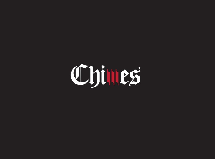
That being said, our newsroom isn’t content to rest on our century-old laurels. We’re fully in the information age; our estimates indicate that our audience is as much online as it is in print. We boast a great, albeit infrequent, podcast. With the “m” made of three abstract wind chimes, this logo stakes our place in today and tomorrow, as much as it respects yesterday.
Lastly, it’s distinctive yet classic. My biggest beef with the old logo is that it lacked character. Nothing about it was memorable. We asked Gilbert to design something that made a statement. However, in some rebranding efforts to be memorable, the final result is tacky and has a short shelf life. As I’ve written before, this is my beef with the Wayfinder logo. Additionally, unlike the Calvin administration, we can’t afford to redesign every five years; the goal is that the Chimes staff of 2059 will find this logo as charming as we do today.
So with great excitement, here is the new Chimes logo. I hope you enjoy it as much as I do.