


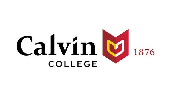
Last August, Calvin College’s office of communications and marketing released its new logo as part of its ongoing rebranding process, which has been in action for over a year. The updated logo, which consists of modernized fonts, bold colors and a new chevron-like symbol known as the wayfinder, will appear on all official college communication products, like student IDs and the Calvin College website.
The logo emerged from a long meticulous process that required extensive communication between designer Tyler Borders, the Calvin communications and marketing department and the students, faculty and staff that make up the Calvin community. Borders, who works for the design firm Dartlet, provided ideas for potential logos that would portray Calvin’s personality.
“We took those ideas and presented them to the campus community in a series of three workshops,” said Tim Ellens, director of communications and brand steward at Calvin. “With each succeeding workshop we narrowed the choices and ultimately ended up close to where we are today.”
After receiving input from the community, the communications and marketing department worked with Borders to refine the ideas and finalize the new logo. Though the final product may look simple, developers intended the logo to have considerable depth and significance.
Through the process, developers aimed to craft more than just a nice-looking symbol; rather, they ventured to create a logo that would be consistent with Calvin’s master narrative of thinking deeply, acting justly and living wholeheartedly as Christ’s agents of renewal in the world. The logo is also intended to be a fresh portrayal of the four key elements of the school’s brand personality – discovery, curiosity, investigation and innovation – while still retaining elements of the school’s rich heritage.
“The college may not look the same as we did at our founding, but many enduring traditions persist, like our commitment to Christ-centered education and our desire to be always reforming,” according to the Calvin College website.
Overall, the new logo’s reception has been mixed. But this was no surprise for Ellens. “I was expecting a mixed reaction and, in fact, sent a note to the cabinet the day before its release saying to expect some strong reaction both ways on the logo. It’s just the nature of this sort of thing.”
Though the logo was intended to carry so much significance, many found it difficult to see the meaning through the design itself. “They’re using three fonts in one logo, and that’s a big no,” said Sunshine Cahill, a senior studio art major. “It looks like it should be the logo of a new mega church.”
“I was talking to a graphic designer friend of mine and she was talking about how the wayfinder concept is trendy. You should never make a logo with something that’s trendy,” said senior geography major Janaya Crevier. “I think it speaks to Calvin trying hard, almost too hard, to be ‘hip with the kids’ or ‘cool with the times’ or something, which isn’t very professional. From conversations I’ve had with a lot of people, it looks kind of cheap.”
Others had a more positive perspective of the logo. “I’m not a huge fan of it yet, but I’ll give it some time to grow on me,” said Ellen Reidy, a junior engineering major.
“The old nameplate looked really old fashioned, so I can see why they wanted to update it,” said Kaitlyn Etienne, a senior environmental studies major. “I think it looks great on the website. And they didn’t have a symbol before, so I like that, too.”

