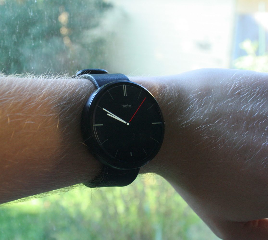
Motorola unveiled its first smartwatch, the Moto 360, two weeks ago. If you didn’t notice, I don’t blame you. The product announcement was a modest press event sans famous rock band. The Moto 360 didn’t receive nearly as much attention as Apple’s forthcoming entry in the smartwatch race, yet it gives the Apple Watch a run for its money both in terms of hardware and software design, and is available today.
The Moto 360 runs Android Wear, an operating system by Google which is tailored for wearables. Rather than attempting to squeeze the functionality of a smartphone OS onto a watch, Wear is an opinionated interface intended to complement rather than replace your smartphone.
The first thing you will see on an Android Wear device is, of course, the time. Customizable watch faces can be installed in a range of styles from minimal to ornate.
Notifications from your phone show up as a series of “cards” with glanceable snippets of information. Users can swipe up or down to navigate through cards, or swipe right to clear a card. Wear also takes advantage of Android’s rich notifications, which can feature images and action buttons. Images show up as the background of a card and action buttons can be accessed by swiping left. Tweets, for instance, can be favorited or retweeted from your watch.
Wear features cards from the Google Now app, which uses your search history, email, calendar and other data stored by Google to predict information that you want to see. In the morning, Google Now displays the day’s weather, driving times to my usual destinations, and events on my calendar.
Apps on your smartphone can also trigger contextual cards on your watch. For instance, while using Google Maps to navigate, your next turn will show up as a card on your watch. While using the camera on your smartphone, your watch will show a button to trigger a countdown and take a picture.
Another way to use Wear is through voice commands. Saying “OK Google” or double-tapping the watch’s display triggers the voice interface. Examples of voice commands include “Send a text,” “Set a timer” and “Take a note.” Voice commands can also be used for text input, for instance, responding to a text.
Wear succeeds in creating a glanceable and intuitive user experience. App screens feature condensed information in glanceable chunks. Most interactions are swipes or presses and there are rarely more than two options per screen.
By reacting to the user’s context, Wear minimizes necessary interaction. The genius of the wear interface is that I rarely have to interact with it. It does a good job of showing me the information I want to see when I want to see it.
The Moto 360 is sleek, elegant and comfortable. The materials and build quality are excellent. I find most watches too uncomfortable for extended wear, but I haven’t had any such complaints about the the 360.
The watch’s defining features are its round body and nearly bezel-less display. Achieving this design was an engineering challenge which required design compromises. Touchscreens require display drivers and digitizers. These are typically concealed in a bezel around the edge of the display. Motorola opted to place this hardware, along with an ambient light sensor, in a small bezel at the bottom of the display. This allows the display to flow to the edges of the device, but means that it is not completely circular. This bezel is an imperfection, but it blends well with the metal frame on the black model and I rarely notice it.
The screen has excellent viewing angles and outdoor visibility, even in direct sunlight. It is not high resolution, but it is meant to be glanced at from a distance. The watch’s battery life is adequate but not extraordinary. In practice, the Moto 360 lasts me an entire day — averaging about 16 hours. The watch charges wirelessly through a provided dock.
The Moto 360 is far from perfect, yet it offers an attractive and compelling vision of the future of personal computing.


